Showing posts with label deck comparisons. Show all posts

Monday, April 22, 2013

Deck comparison, Three-Fold

So a while ago I asked for suggestions to do a deck comparison type post series on. I've not forgotten about it, and decided to start off with a couple of posts following up on an idea posted by thesycamoretree: something Thothy, something RWSy, and something Else. These will be done purely by my own intuitive readings, with no reference material. Why? Because anyone can look up the difference in these decks as written down in books, so why read me rehashing the same thing?

To start off with, why not begin with the actual Thoth and RWS (Smith Centennial ed., in my case) and add the Mary-El to that mix? 
---

Starting off with my favorite of these, the Thoth. Here, the King has been transformed into a Knight - less the superior to the Queen than her equal, and more dynamic a concept than the King image. It can be confusing at first, but I find with this in particular its best to just roll with it, is what it is, and onwards.

The Knight of Cups rides his horse, a pure white pegasus, symbols of god and of purity and power. He rides it upwards, away, showing the kind of optimistic ambition that can be associated with this card. Take that too far and you have escape into unreality, escape into dreams, escapism into the cup or so many similar things. Here, more positively, he rides above the wild wave, controlled in his motion so that they do not touch him. Just sketched into one of these waves we can see a peacock: so much show, and isn't it true? Doesn't he grave the applause just a bit? Emotionally he does, for reassurance rather than ego perhaps, but nonetheless.

Emotional energy as power here: the glowing of the cancer crab in the cup, the wings that sprout out of his back. His armor is green, like the suit of the Fool: optimist, faithful, ready to push forward into the unknown anew, but perhaps sometimes less than fully aware of what he should be aware of. His strength is his heart, his connection to others. His horse looks back towards him, ready for the next command, ready to work together brilliantly, as they are wont to. The image scheme here (weird yellow tint of the digital image aside) is largely blue and white, appropriate for the pinnacle of the watery suit, and bringing out the contrast of the armor and the cup even more.

In contrast, the figure in the classic RWS is far more sedate. He sits on his throne, dressed primarily in blue es well. Waves surround this seat, and we can see him holding a cup in one hand, a lotus shaped scepter in the next. We see fish and a ship, just barely, in the water behind him. The ship for movement and fortune (it takes money to launch one, after all) the fish for bounty perhaps?

Looking at this card I am reminded of how, so often, people say that the courts are the hardest of the tarot deck to read. If one is talking about the RWS, I cannot say that I much disagree. We have a king on a throne, facing towards the right, holding a cup and sitting still. He looks comfortable there, I suppose. I cannot say that, from image alone and without my knowledge of memorized meanings, I can get much from this card. This is in major contrast to the Thoth's, where I am struck immediately by all the details and could go on and on about it for ages. This one evokes...nothing. I have to go back to what I 'know' this card to mean.

Color-wise, it is a nice scheme, blues and greens with just a bit of red makes a nice contrast, and I do quite enjoy the muted palette of the centennial edition.

Lastly, we have the Mary-El king. This deck dances to its own tune, its own internal scheme and ideas which are not necessarily drawn directly from either major tarot tradition. The deck creator had very specific meanings for the imagery in mind, but they don't jive with me, so I use my own take.

Immediately, I am struck by the composition of this card. I am reminded of the famous painting of Ophelia, drowned. Like this king she lay half-submerged in water, surrounded by lily pads, flowers. There are many things a king of cups can drown himself in, should the darker aspects of his nature overwhelm. But there is a different here, between this king and the girl: the trident. Poseidon carried a trident, in mythology, a tool through which to channel his godly might, and his symbol.

He does not drown, does not die, merely floats. Perhaps indeed this is merely a swim in the water, a moment of relaxation, a return to easier, less complicated times. Not all escapism must be destructive or dangerous. Sometimes a long bath or vigorous swim is just what we need to take our minds off of too stressful things, to get back the perspective we need.

The nudity of the King also works for me. It general nudity can signify great strength or great vulnerability. This king can exemplify both, at different times. A different take here, on the water element aspects of the card than in the others, but comes through loud and clear nonetheless.

--
The message of the day then: to move towards what you want, and do not be afraid to let yourself move forward with optimism, or to take a but of a break for distraction - but do not let that distraction take over to the point of causing vulnerability, weakness.

Wednesday, February 6, 2013

kings and knights and pondering technology

In a quite distinctly modern take on the King of Swords, we have the man piloting what looks to be a fighter jet of some sort. I say that based solely, of course, on my experiences in the Smithsonian Air and Space museum. One thing I love about DC is that there are so many completely free museums...

But yes, planes, jets, bombers. It's amazing when you think of it, how rapidly aerial technology developed. We spent thousands of years never more than dreaming of flight, and then suddenly two brothers put together a flimsy contraption that manages to take off and stay in the air. Less than two decades later planes are being used in the first world war, with stunningly high casualties for pilots. Scouting missions at first, but well...someone gets the bright idea of shooting from the plane and then everyone does it and then there is bombing, gassing, machine guns mounted on. By the second world war they are made of cold metal, different types, models worked by nascent air forces, day and night bombing, the blitz, firebombings that kill so many millions in certain cities, nuclear bombs dropped too... Now we have drones, man-less aerial craft that can go across borders, spy and kill who knows what and where and why...

Isn't he all about precision, focus, this King?  Isn't he all about coldly judging what to do, using logic, and getting it done? Efficiency, detachment.

And quite similar to the Thoth knight he is too - the same armor but now of course it is a shirt with a modern decal. Instead of the golden steed we have the jet, its windows tinted yellow, the screen in front of the knight so that he may measure, analyze, target. No more need for extended daggers and swords. Now you point and click and things are destroyed, accomplished, undone.

Now you point and click. It boggles my mind, how much of a pain focused, graduate-level academic research must have been before the advent of computers. I have a topic and I type a few words into some search engines and pull up numerous articles going back decades, pull up a list of relevant books, many of which have the parts I need available on google books, others downloadable, or easy to reserve so I only have to stop by the front desk of the library. I can pull up newspaper articles from any number of publications. I can even find documentaries in other languages, programs from the National TV station of Algeria and from Al-Jazeera, and sit back and watch. All of this in a single afternoon, and save everything that looks relevant to my oh-so-easily-searchable gmail account, and voila the bulk of the legwork for an important project is taken care of, to be continued at my leisure.

The same spirit and drive this knight has, in both depictions, and the same goals and purpose. But means change, presentation changes, even attitudes change. Technology does have its drawbacks and I think many of them have more to do with attitudes it engenders than anything else. Why memorize when you can always look up, right? And yes, in many ways memorization is not efficient these days but stretch the brain muscles it does in interesting ways, to be able to recite things at length from memory, lists of names and poems. Even worse is the way so many people use computers and tablets and such in class. I've tried it both ways, and granted, my note-taking is always questionable - but my mad doodling helps me think, and more importantly paper and pen do not offer nearly as much opportunity for distraction and shortcuts which undermine learning processes. I had a classmate in Tunisia who would look up words while speaking in class on google translate, his laptop always open, and yes so you never search for a word but you also never remember the ones you use afterwards.

But so it goes and so everyone chooses for themselves how to use the tools they have, and in many ways, if you are like the king of swords...there is so much you can do with it. There is so much possibility. You can fly so fast and so unimagineably far. Goggles and gloves and glittering wings; even with so much power, he still enjoys the experience, the forward momentum of his ability.

Sunday, January 6, 2013

Amazing Aces: Coins

And so we get to the fourth in the favorite aces series. I've enjoyed doing these, and it's been an interesting exercise to see how the decks I chose from for these differed from my choices for favorite majors - though of course, the fact that decks keep going in and out of my collection is a bit of a factor too. It does make me more aware of the different strengths of various decks. For example, of my two most favorite decks, not one Ace appeared here.

In any case, last but not least in the Ace of Coins (also known as the Ace of Disks, or Pentacles). This is the card I associate with material opportunities - careers, finances, physical health and all that. It's a card that that I see as being the most solid, speaking of the pragmatic. Whereas other majors may fill be with inspiration or energy, in this one I often find relief; I suppose at this point in my life I am more likely to stress about finances then intellectual development or relationships ;] It's also one of the Aces I associate most strongly with color. I like to see earth in this card - green, brown, gold. So which ones speak to me most?

Shadowscapes

I must say, I really enjoy how this Ace is presented in the Shadowscapes tarot. Iguanas are definitely not an animal you see associated with this Ace or suit often. They really work here though, both color-wise and in terms of associations -  the iguana is an earthy kind of creature, after all. We see smaller lizards too, the progression of growth and accomplishment. The golden coin we at the bottom is stamped with what could be seen as a star, or a kind of sun, or maybe even a flower - all symbols of success, fortune, hope, growth.

Of course, the colors and composition in general are beautiful, as they are in most of the cards in deck. The two branches curving upwards subtly support the underlying message here, the opportunity for earthly, material growth, as does that ring of light behind the iguana. The green of this card offers a nice juxtaposition to the silvery purple borders - many of my favorite cards in this deck have this kind of greenish scheme. A bit unusual an ace, and lovely.

Alchemical Renewed

Once again, the Alchemical tarot presents a take on an ace that I rather adore. The clean lines and line-type shading work really well in this image. Earthy, nature scenery dominates the picture: a hill covered in grass, flowers, leaves and weeds. At the top of the hill we see a sturdy tree with bright green leaves, and right in front of the coin we have a rabbit, hopping forward. Rabbits are associated with fortune, aren't they? Well, their feet at the very least, but that is a horrible custom and I think whole, living rabbits make much nicer omens of good luck.

On the whole, the image is rich in color, in life. It makes me think of spring time, or early summer: beautiful weather, a great time to make a start of a new thing. The rabbit is a fast-moving animal, energetic. The trees and flowers show that the soil is fertile. The time is right, the situation is ripe, things can go your way, this card says. The animal theme continues in this suit as well: in the Ace we have a rabbit, full of energy but small, vulnerable; in the King we see a lion, mighty and powerful, on top of the animal kingdom.

Legacy of the Divine

Interestingly enough, LotD, one of my favorite decks overall, is a mixed back when it comes to Aces: two of them I really like, and two I don't much like at all. This, along with the aforementioned Swords ace, is one of the good ones. Again we have a nice big golden coin, with a star design and a convenient elemental symbol, surrounded by nice, green, earthy imagery. We have a bee and some acorns, which can signify hard work and potential for growth, expansion, wonderful things. Acorns can also be seen as a kind of nourishment - the resources needed to get you through hard winter times and towards those goals and achievements. We can also see, in the lower right corner, a hedgehog. Not a particular noticeable animal, not striking to the eye, and yet - he has his quills to defend him, and he moves steadily, close to the ground. Again, much of my liking of this card stems from its general atmosphere - the impression of richness, of fertility, lots of room for expansion, success and comfort.

Tuesday, December 11, 2012

Amazing Aces: Wands

Getting back to this particular favorites post series, we have the third of the four aces, the Ace of Wands. The wands suit is typically depicted, in those decks that use elemental associations, as associated with fire - the light, the burning energy, the passion that the cards within it often speak to. This Ace, like the others, is about new beginnings and opportunities, yes - about those involving creativity, self-fulfillment, ambition, drive. This Ace calls for action in the post literal, direct sense: go, do, create, be brave. It is about potential ready to be worked, shaped.

It is, in fact, probably one of the Aces I would see as being easily applicable to a wide variety of situations, even those typically associated with the others suits - yes, go learn that thing that you care so strongly about; yes, initiate that romance you are daydreaming about; yes, apply to that job even if you aren't sure you could qualify. A very dynamic card, on the whole. As for which of my decks I feel depict it best...

Alchemical Renewed

Though many decks utilize elemental associations and imagery in their depictions of the minors, few, I think, do so as neatly as Robert Place's Alchemical. I especially like how the theme of the animals continues through the suit - the baby salamander in the Ace reappears, majestic and grown, as the wand's King. The salamander makes a rather good metaphor for the Ace in general - here it is small and newly born, but already we can see the hints of its future power, the way it lays on a bed of flames at the wand's base.

The tip of the wand burns too, of course, illuminating the space. I find the clover sprouting out of the side a very nice touch. A clover for luck, a sign that now is indeed the right time for whatever this card is speaking to, that the universe is on your side; and at the same time, a reminder of the idea of making your own luck, the need to act, to take advantage of the opportunities that present themselves to you. The line work and coloring here is awesome, the palette perfectly suited.

Tarot of the Absurd

Can it be, one might ask? Can a black and white deck really manage to express all the energy and meaning that an Ace like this is meant to represent? The answer, as the Tarot of the Absurd here shows, is very much yes. Like just about all the cards is this lovely deck, the ace of wands has a certain playfulness to it, a touch of whimsy. Though it features a tree, something we usually associated with age, tradition, firmness, here we see it dynamic, in motion, sprouting new branches and, at the center of the image, curled around a newborn.

Yes, the tree here moves and sways and curls so as to protect this creature, newly entered into the world, just formed, inexperienced. A beginning indeed, a wealth of experiences to be had, discoveries. The baby still sleeps but the tree does not, no. Nothing here is a passive act, not holding, protecting, caring. Everything requires deliberate effort, decision. What will become of them, this tiny babe, this almost dancing tree? Time will tell indeed.

Silicon Dawn
I drew and wrote about this card in my very first post on this blog, just a day short of exactly a year ago. At the time I was desperately scrambling to finish a rather long and important paper - rather the same as I'm doing now, come to think. Changes and beginnings and repetition. The deck was quite new to me then, and I was still trying to wrap my mind the rather unusual switch, of elemental associations and to a large degree meanings, of the wands and coins suits. Of all the switched up cards in the deck, this one perhaps makes the most amount of immediate, intuitive sense to me.

Why shouldn't the Ace of Wands be seen like this, a confident silhouette of what may be sprouting out of a plant, leaves and roots and vines supporting  and pushing up. The green of the ground slowly turns to blue as we reach the top of the card, to sky, freedom, so much possibility there. We plant seeds in the ground, little kernals of perhaps, and wait and watch them grown into things to beautiful hey take our breath away, sometimes. And isn't that what this card can be, at it's best - the reason we see it and know we should go, try, take that risk?

Tuesday, November 6, 2012

Amazing Aces: Cups

So, to continue with the favorite Aces series, we move onto the second of four - the Ace of Cups. In contrast to the Ace of Swords, which as I wrote before, tends to have that kind of dual nature - new starts but also cutting away the old, severing, the cups Ace tends to be more uniformly positive in meaning - then again, the cups suit in general, one could argue, is a more positive suit.

What does it represent in readings, this Ace? For me, it's usually about new beginnings, opportunities which will be emotionally fulfilling - things that call to your soul. It can be the beginning of a new relationship, a new friendship or romance; it can be the start of, or an addition to, a family. Good feelings, intuitive growth, taking things to a new level with something or someone you care for. So which decks, from my current collection, do I feel represent these ideas best?

Swedish Witch

I really like how the Swedish Witch tarot presents this Ace. Like the rest of this deck, the card's artwork is rich with symbolism, without seeming overly-cluttered or busy. It takes the traditional Ace image of the large cup and really spices it up with a lush background - pond with reeds and lily pads, frogs and fish and colorful birds, even a mermaid sitting at the base of the cup. You get the sense of a warm, comfortable, nurturing environment. It's an ecosystem, symbiotic, natural, everything coming together, each creature with its own niche in the grand scheme of things.

The sun rising up out of the cup really shows the positive energy that the ace often represents, the light that these kinds of opportunities can bring into your life. In the unicorn that decorates the cup, I see just a bit of whimsy, a bit of the fantastical - permission to let yourself dream, to let your fancies take you wear they might, to let your guard down and simply enjoy what's here in front of you today. 

Victorian Romantic

The Victorian Romantic's take on this ace is another firm favorite, taking a rather different approach to the card. One of the things I really enjoy about this deck is the balance it strikes between maintaining a firm RWS influence while having enough of an original aspect to each of the cards that there is plenty to read in the images without resorting to purely standard meanings. Here, we have a lovely picture - the artwork itself is just incredible - of two nude figures meeting under water. One sits in the shell, the other meets her from above, bathed in a shaft of sunlight.

Is he approaching or being pulled away? It's a bit hard to tell, open to interpretation. The bond though, the strength of their connection, is obvious. They are willing to overcome obstacles, the pull of the waves, to meet. If this is a beginning, what will follow? The possibilities are many. In their nudity, they allow themselves to be vulnerable, to see each other as they really are. The old-style natural body shapes here a welcome relief from too many decks with too-perfect slim and tones and bustily presented forms. The color palette is incredible.

Golden Tarot of Klimt

Finally, we have an ace from the Golden Tarot of Klimt. Unlike the others, there is no elemental symbolism in this card, or in the minors of the suit generally. The color palette too, is rather different. Usually I like my Aces to be watery, so why pick this one? Honestly, I though the image we are presented here was perfect, conceptually. What's interesting about this deck is how both this card and the two of cups have couples. But whereas in the latter the couple in naked, familiar, intimate, embracing each other in what seems to be a time of distress, here we have a picture of the relationship at its beginning.

Here the couple, though firmly drawn to each other, is still at the start of things. They are dressed rather formally, as if for show. Their embrace is likewise proper, with a certain element of stiffness, distance - they aren't yet, in spite of their developing feelings, quite comfortable together. And there are the roses everywhere, beautiful, tokens often given at the start of courting. They still mean something, here. Later, simply a touch, the presence of the other would be enough. There is potential, still undeveloped, here. The relationship can grow, like a well-tended rosebush; or wither, a plant neglected. 

Tuesday, October 23, 2012

Amazing Aces: Swords

So to follow up from my now completed Favorite Majors series, I decided to focus on another set of favorite cards from my deck collection - Aces. They are minors, but particularly notable minors, seeing as how they open up the suit, and how often they reference major changes, new beginnings and the like. In some decks, they can be drawn rather generically, a utilitarian approach that gets the message across well enough. Other decks though, have particularly nice, thought-provoking depictions. Why not focus on those some?

The Ace of Swords is. I think, an especially interesting Ace to start off with. It's one I personally see as having many layers, both positive and, if not quite negative, sometimes difficult. It can encompass both attitude and action, internal and external, beginnings and ends. So which ones do I like best? After some consideration, here are the three favorites:

Legacy of the Divine

Like much of this deck, the visual aspects of this card are quite stunning. I quite like the color palette especially, as well as the modernized, fantastical qualities of the ace itself. The background of clouds emphasizes the air element nicely, and calls back some of the traditional imagery of the RWS and Thoth Aces - although interestingly, here the Sword is pointed downwards rather than up. A focus perhaps not just on moving forward but also on cutting away, severing, getting rid of that which no longer serves.

I also like the eagles that circle the sword - fierce birds, noble and strong, ruthless when necessary. A good reminder of some of the kinds of traits that Ace of Swords situations can call for. Finally, we have a glowing air element symbol and the astrological wheel in the background, reminding us again of the outside correspondences we can use for additional meaning if we wish, and the grand scheme of things.

Silicon Dawn

The Silicon Dawn Ace of Swords provides us with a rather different image. The color scheme, for one, is at the complete other side of the spectrum. I must admit that I've never been of the school that sees yellow as a particulary airy color - to me it is too close to gold, to the earth-tones. But I can set that aside here, because it works. For one, I like the way the yellow fades into that pure, glowing white at the feet of the figure - an image of manifesting energy, potential.

I love the theme of gears and cogs too - simple details that speak loudly of engineering, of inventions and creativity, the wonders a mind can come up with when it sets to work at a task. A lot of times, the swords suit, which is the suit most associated with intellect, is used to depict the problems our minds can make for us: anxieties, grief, insecurity, self-sabotage. Here, instead, we are allowed to focus on the positive, the wonders we are capable of creating when we think.

Mary-El

The Mary-El is a deck newly acquired, so much so that I haven't even finished trimming it yet. Already though, many of the images are so arresting. This one in particular caught my attention. Again we have the image of an eagle, this time in a much more thought-provoking position, bound upright. The accompanying book, though it rather bizarrely associates Scorpio with air, does provide some interesting insight.

In particular, it speaks of redemption, of evolution, of rising up out of darkness, out of air and water and into the sky: the freedom that flight represents. Again, the emphasis not just on the difficult aspects traditionally highlighted by swords but also on free will, reason and purpose and communication. I especially like the idea of this card as speaking of striving, of doing what we must to free ourselves of those constraints, of seeking clarity, dreams and ideals. It is a card of channeling our visions and working to make them happen; a personal. internal kind of empowerment.

Wednesday, October 10, 2012

a matter of perspective

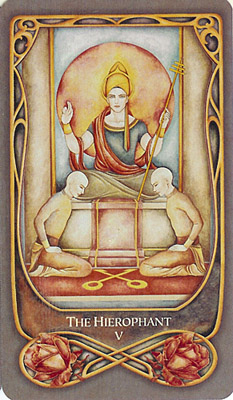
There aren't all that many decks in which I really like the Hierophant card, and this is all the more true of straightforward RWS clones. I like the Nusantara's of course - I love everything about the deck - but by and large, decks that hew too closely to the original suffer in my eyes because, well...

Though it has grown on me over the years, overall, the image presented in the RWS Hierophant is one that, for me personally, is difficult to connect to the more positive aspects of the card. I know that the Hierophant isn't only about the rigidity of authority and tradition, isn't only about oppression of hierarchy and structure, isn't only about the burden of duty, being a follower. And yet, when I see the christian-tradition priest...

We are all so very much made up of our experiences...sitting in church pews as a child, listening to things that never connected, never felt any kind of true...politics and politics, listening to people twist those same ideas into something even more intolerable...

I can appreciate Pixie's artwork, and I can read and study and educate myself all about the esoteric layers and yet... the same way that I cannot help but think of churches whenever I smell frankincense  The downstairs neighbors in Tunisia would burn it during Ramadan and all night, all I could think was...why does my apartment smell like a church? Some associations just...stay.

Whereas an eastern-influenced Hierophant, the exact same imagery, position, ideas, simply represented in a different flavor, a buddhist flavor...


I cannot really believe any religion, and yet I've always found a certain appeal in the wisdom there. I've read a couple of the Dalai Lama's books, some Thich Nhat Han. I can see them as a teacher, a guide, structure that helps rather than stifles.

I found this wall hanging in a Tibetan shop I stumbled into some random night last year while waiting to meet up with someone. I got it because it is true, and because it is something that I really do need a reminder of, sometimes.

Glance at it there, on the wall. every day. Repetition. Truth-repetition.

Saturday, October 6, 2012

Cardstock: Highs and Lows

So back on the tarot forums, many a thread and comment can be found on the subject of cardstock. For some, this is a major dealbreaker when deciding whether to get or to keep a new deck. I don't take it as seriously as some - if a deck has enough other merits, I'll likely keep it almost irregardless of the cardstock's level of mediocrity. That said, it is something I note, and I figured it would be interesting to post about  my favorites as well as about some worst offenders from my own collection. This is of course highly subjective, based on my own particular likes and preferences; also, only somewhat correlated to my level of like for the deck overall.

FAVORITES

1. Thoth

When I first got the Thoth, it was a more recent printing, but after reading about the superiority of older copies, I eventually procured for myself a 1986 AGM printing. This is one of those decks I've done a bunch of things to: trimmed it, gilted the edges in a kind of bronze color, etc. There really is such a world of difference in the older printing and the current ones. The cardstock is much, much nicer on the old, and the colors are richer as well, with better contrasts. 

It shuffles very nicely. The smaller post-trim size is perfect for me, and...yeah. Not too thick or flimsy and not plasticky. Great with post over-hand and riffle shuffle methods.

2. Absurd

As I said in other post about it, I really do enjoy the cardstock of the Absurd tarot. The feel of it in particular is really nice - someone described it as buttery and I don't think that's inaccurate way of putting it.

It's a nice medium, not quite matte but not over-glossy, and it really brings out and plays up the contrast of black and white of the images really well. I love how nicely it shuffles, again, being great for either method.


3. Swedish Witch

Lastly, the cardstock of the Swedish Witch tarot I have is quite nice as well. Not sure exactly which edition/printing it may be...I bought it in a new age shop during my visit to Sweden last year and the box is probably somewhere in the depths of my parents' house by now. After trimming it a bit, the size is again exactly how I prefer my decks to be, and overall, I find it quite similar to the Thoth in feel. I have no issues shuffling it in any way, it doesn't feel stiff or floppy, and it showcases the colors of the images quite nicely.

WORST OFFENDERS

1. Light and Shadow

I had such high hope for this deck, and I still do really like the actual images of the cards and how it reads, but well - as far as cardstock goes, ugh. The cards are huge and impossible to trim much. Not only that, but they are flimsy, floppy, and very plasticky feeling. Huge floppy cards do not for fun shuffling times make.

They also, for some bizarre reason (I've not encountered this on any other deck thus far) put plastic on the EDGES so that any attempt at gilting them is...not very successful.

This could be such an awesome deck, but the horrid cardstock instead places it rather far down on my list as far as preference goes. Publisher really did it a disservice :/

2. Corte dei Tarocchi

Ok, so first of all, I do get that this one was printer more as a collectors item than with reading in mind. That said, I have a thing about reading with ALL of my decks, and well.

In my life, I have not seen a deck with cardstock thicker than the cardstock of the Corte dei Tarocchi. Or even close to it. The whole deck stands in a tall, tall stack, and shuffling it all at once in any way is exceeding difficult. I've even had to adjust my method of choosing cards to ensure its properly mixed/random.

That said, it does feel nice (if unlaminated/delicate) and overall I do quite enjoy this deck muchly. But the shuffling.....

3. Sun and Moon

This is one of my favorites, but in the wider online tarot community, it seems to engender rather varied opinions. Some people, like me, quite like it; others have a very low opinion indeed. Among the latter, the cardstock quality is often mentioned, and in that regard, I really cannot argue. I love this deck in spite of its cardstock, because its other merits are just that high, for me.

Whats wrong with it? Well, to its advantage it isn't uber-glossy like some USG decks of recent years, but...cardboardy would be an accurate way of describing it. Moderately thick and really really stiff. Shuffling it is possible, but not easy. My trimming and gilting experiments have improved it much in my eyes, but nonetheless... Not exactly a fine example of great quality printing as far as cardstock is concerned.

Sunday, September 30, 2012

My Favorite Majors: The World

So, here we are: end of the line, last of the majors to pick favorites for. I've really enjoyed going through each of them one by one, picking the cards I liked most from my collection, pondering why it was that those were the ones I enjoyed most. Also, interestingly enough, posts from this series seem to be, by far, the most often viewed ones on this blog :0

Anyway, yes, the World - a card of success and completion and fulfillment, journeys coming to an end. A lot of decks tend to hew to the same basic concept illustrated in both RWS and TdM, though with their own various takes on it. In general, its not a card I have many qualms with in most decks, though also...rarely a favorite.

I had trouble choosing two out of the three I narrowed down my selection to - and well, since this IS the last card in the series, figured what the hell, I can break my two card rule for a second (and last!) time ;]

XXI. World


Favorite:
Of all the many deck-variations on the traditional image of the woman inside the large wreath of accomplishment, I've long been very much partial to this one. I love the dynamic, sensual energy of it: the woman here isn't just standing there, but rather, seems to be dancing, celebrating. The feeling of acceptance, of confidence, of completions, success - all of that seems to be here, much more so than in other cards with similar imagery. Looking at this card, I can feel the meaning it is supposed to be representing.

Of course, the lovely use of color here certainly doesn't hurt. As my previous posts in this series probably have already made clear, I am very much a color-oriented person. The use of the yellow-gold as a background here works really well especially. Love the details in the wreath, the animals, and of course those pillars which surround all of the majors in this deck. Stained glass effect works wonderfully here.

Runners Up:
As for these two, I couldn't quite decide between them because...they are so very DIFFERENT, and yet, both have aspects to them I really like. For the Aquarian World card - well, it definitely does not have the kind of wild, dynamic energy I see in the other two, but makes up for that with...well, I must admit, I have long been very much a fan of art-nouveau and art-deco, and the application of those to this card, done so thoroughly, with such lovely thematic consistency and attention to detail...I just love it. The color scheme is lovely too - not one you see very often, but more striking because of it. I particularly enjoy how it has all the basic aspects of the RWS but...re-done, re-imagined, stylized so nicely.

As for the Thoth...I've written about this World card before, more than once. I really do love it. Naked woman of gold dancing with a snake and all that it can represent - oroboros, beginnings and ends; she is dynamic, the universe opening up quite literally behind her, intimate and public all at once. Stars, the outline of ancient structures...and that, all of that, is only the surface level of the card, my own intuition - how much more to read about, dig deeper in the other layers that the Thoth deck has to offer...yes, a worthwhile take indeed.

Thursday, September 13, 2012

My Favorite Majors: Judgement

Wow - up to the second-to-last in this favorite of major arcana series. What shall I follow with once this is through? Shall have to ponder that a bit...

Anyway, onto the card at hand. This one, I must admit, is funny in its own way in that...the message of the card, once I got the nuances relatively straightened out in my mind (such as Judgement vs. Justice, Judgement vs. Tower, etc), resonates quite strongly with me, and yet the actual IMAGERY in most decks does nothing for me, one of the most blah cards in the deck. This is likely to do with the fact that both the RWS and TdM traditions rather strongly reflect christian archetypes, particularly those to do with the afterlife and morality (ie. last judgement [for sins]) which, given my personal belief system, really don't do it for me at all. So in many ways and in many decks, reading this card comes down to reading despite the card image rather than through it.

There are of course, a number of exceptions, and these tend to be quite lovely. Was not too hard to pick my two favorites this time. I do realize that this series has a lot of repetition in terms of the decks that my choices come from but...what can I say? My favorite decks are favorites for a reason.

XX. Judgement 


Favorite:
I must say that really, I just LOVE the colors in both of these takes on the Judgement card. Nothing blah about these from an aesthetic perspective - quite the contrary really, the bright blue and orange jumps right out at you, demands some attention. The colors feel so alive, and I love the way that the sun illuminates the people at the bottom of the card in the Nusantara tarot. Speaking of those people - I've said it before and I'll say it again...I just adore how this deck manages to hew so closely to the spirit of the RWS, quite close enough to be considered a clone, and yet has its own take on everything, completely removed from the traditional western-centric christian-inspired aspects of the imagery. Instead of creepy zombie people crawling out of graves we see a group of various genders and ages rising up out of water, which to me encompasses the idea of listening to a call, reaching up for a new start, so much better. You have the trumpet metaphor, the higher being, angel, the rolling water - yes, listen, yes, it is time, yes choose, yes rise. The card speaks to me. The composition works really well too, and yeah. The colors...such eye candy for me....
 

Runner Up:
First of all, I know I've written a bit about my take on this card in past posts and don't want to repeat myself too much, but it really is one of several of the majors where...I so, so much appreciate and agree with the Crowley Thoth's take as opposed to the RWS...just makes so much more SENSE to my mind.  The ancient goddess nut stretching out over the world, the bold colors (interesting how closely these two cards mirror each other in color scheme!), the astrological association with pure elemental fire, renewal, the burning away of the old, new wild energy. The symbolism of the old god, the old ways, sitting static and tired in the background, small. And in front, the new god, young still, transparent, the coming of a new age, Aeon, transformation, deliberate, and you stay mindful of the old, the way that you can see through him, but that isn't you anymore, shouldn't be; time to leave it behind, listen, judge, choose what to take with you in the future, deliberate. Symbolism-rich and aesthetically stunning - what's not to love?

Thursday, August 2, 2012

My Favorite Majors: The Sun

So finally we get to the Sun card - the most clearly, unquestionably positive card in the Major Arcana. Its hard not to like this card, seeing as how in readings it pops up to tell us good things - reassurance, success and the like...

I find that there is a nice variation in how the card is presented in various decks, particularly since - unlike some of the other majors - there is a significant difference in how it is represented in the 'big three' - TdM, RWS and Thoth. Subsequent decks tend to do their own take derivative of one of those takes and...yeah, lots to choose from, among my decks. My final selections, as we can see, are a bit more on the 'out there' and of the spectrum.

XIX. Sun


Favorite:
I've written about this card before, and yeah, it is most definitely my favorite Sun card. I love the Magical Forest deck in general; it is a lovely, quirky, endearing take on the traditional RWS imagery. I think that having kangaroos represent the figures in the Sun card is brilliant. Having a joey in a pouch as the traditional child, with the flag of victory and everything, really works here and leaves lots of room for reading, as I kind of went into in more detail in the previous post on this card. I love the coloring - very sunny and yellow, but not in an overwhelming way, with just a bit of a suggestion of too hot, too much of a good thing, for that kind of potential reading into it too. Love the way the field of sunflowers is drawn. Everything, basically, about this card very much appeals.

Runner Up:
So it's a bit funny that this is my second choice because, as a rule, I tend to very much dislike the TdM tradition's take on the Sun...the whole children frolicking under the sun image doesn't really evoke for me the kind of happy success meaning this card is supposed to express, particularly when combined with the art style of most TdM decks. However, in the de la Rea, this image is abstracted to the point where I do not see children in the figures, rather just the concept of individuals - ageless, genderless - celebrating or enjoying themselves. In some ways - that ribbon - they are tied to each other, and in other ways they are distanced, disjointed, masked, apart: that great gap that always, even in the best of times, separates each one of us from everyone else. The deck also abstracts the actual sun in the image, makes that a mask too, which I appreciate on an aesthetic level - the gentle gold and silver paint on the cards in real life really makes this just lovely to look at. Love the colors on this card in general actually, the balancing of red, gold, blue, and the hint of minimalism - that broad swath of white background - really brings this together for me. I find it reads awesomely.

Friday, July 13, 2012

My Favorite Majors: The Moon

So the Moon...tricky major for a tricky concept, I suppose. The Moon has always been a card, kind of like the High Priestess actually, where I kind of instinctively KNOW what it is talking about and yet it is often difficult for me to put that properly into words, both in general and sometimes, in the context of a reading as well. Now that I think about it, perhaps this makes the actual art in a deck especially important: for cards where I am comfortable with the meaning, know how to articulate it well, any art will do; it might add nice extra layers or nuance, but the basics can be applied to anything. On the other hand, with something a bit less...clear...art can really help or challenge you, depending.

In general, the moon is kind of the opposite of the Star for me, art-wise. In this case, few decks have a Moon card that I really find stunning, even many of my most favorite decks... But of course, going through my collection I did indeed manage to find and choose two that are quite lovely.

XVIII. Moon


Favorite:
Simple/small thing though it may seem to be, one of the things I like best about this card is the color scheme. The slightly muted purples go perfectly with the back, grey, and white, and the combination gives the card a moodiness that fits just PERFECTLY with the meanings of the card, for me. I love the water and moon connection, and the way that the dog is incorporated here. Usually we have the dog or dog-like figures in moon cards howling or standing guard, but here it is swimming in the water - at once both struggling to stay afloat (very in keeping with the card's meaning) and also, potentially, providing some much needed comfort/companionship for the woman sitting in the crescent moon above. I love her posture there, so very much embodying...apathy, depression, indecision, uncertainty, despair...the way she sits on and at once becomes the moon, and the scorpion-tail there too, warning of danger and secrets and lies, potentially...the art is pretty straightforward stylistically, but very much to read here from my perspective. This take on the moon, everything together, just really speaks to me.

Runner Up:
Another lovely gem from the Light and Shadow tarot here. If it wasn't for the unfortunate size and cardstock, this really would be one of my top decks, I think. The black and white color scheme is great in general, and works especially well for a Moon card, to me at least. It's the details though, that really make this image shine for me. I love the contrast between the two dogs, the one on the left looking extremely aggressive, the one on the right far too sad, apathetic. I love how the water between them, with the lobster/crab at its foot, slowly turns into a bed, into night and dreams and the land of the not-quite real. Are those two towers even real, then? The art itself leaves you with questions and uncertainty, a certain blur in concept that fits perfectly with what the Moon means. The actual crescent itself here seems to be sleeping contentedly, but given everything else we see on the card...well, lots of room to interpret, shall we say. Lots of food for thought here.

Monday, July 2, 2012

My Favorite Majors: The Star

This is, in just about every way, one of my favorite cards. In terms of artwork, it is very often one of the most excellent of the majors in a deck - in fact, I can think of several decks I don't particularly like overall, but which have amazing star cards. I love the concepts behind the star (not least because it often comes up in readings right when I most need it) and love seeing how it is executed in various artistic styles, color palettes, etc.

I kept putting off writing this post, in fact, because I didn't want to have to CHOOSE between a handful of favorites from among my decks. Like I really, really had trouble narrowing it down to just TWO. But, those are the rules I set down for myself with this post series, and so...

XVII. Star


Favorite
I realize I have quite a few cards from the LotD up here in the favorites; in my defense, the majors are my favorite part on that favorite deck of mine (have a more issues with minors/courts) and...well. What can I say, I guess. I really, really like this card both on a visual and on an intuitive level. The colors work perfectly for me...blues, with just the right amount of white light, the right amount of shadow...this is a card served really well by those fade to black borders, methinks.

We have ruin at the bottom of this card - some kind of ancient structure, or perhaps the wreckage of a ship, jutting out of a pool of stagnant water. The way things can fall apart and then stay there, in pieces, as if to remind us of those previous failures. But then we have the woman, the fairy, whatever the figure is, really, real or unreal, drapes in scarves, pulling a stream of stars out of the water and connecting that with the stars in the sky above. Salvaging, healing, renewing, guiding. So many ideas to build off of in a reading from this one image. The card really speaks to me.
 
Runner Up
As I said, it was really difficult to choose just two favorites for the star card. Ultimately, I went with this as my second, the Star from the Golden Tarot of Klimt. It hews pretty far from the traditional star images in the RWS/Thoth/TdM traditions. It doesn't even, arguably, at first glance present the same kind of mood/feeling that the star is usually associated with. But as I wrote a while ago when working with this deck, that's kind of what I really appreciate about it. This card speaks of the realities of hope, realities of the times you need it, realities of where you can find it. It presents the less idealized, less stylized representation of this major. It speaks to be very viscerally on an intuitive level, and presents a nice change and a challenge in a way that the traditional image of a pretty woman pouring water does not. Also, especially in real life with the gold foil...this card just is artistically stunning.

Thursday, June 14, 2012

My Favorite Majors: The Tower

The Tower is, without a doubt, a major with a very well defined, strong message. Regardless of what deck I am working with, when THIS comes up in a reading, I have a good idea of where to begin reading/what it could mean. It's been kind of a theme in my thinking about life for a while now, so pretty familiar with this card, and actually do have a certain odd fondness for it.

That said, it was rather difficult to pick out favorite cards for this one - not because there were so many that I loved, but rather the opposite. Not that I actively dislike most tower cards more...I feel neutral towards many. They are nice enough, and they get their point across well. But very few, I find, really shine either aesthetically or conceptually.

XVI. Tower


Favorite:
There's a lot to like about this tower card, for me. Firstly, the color scheme makes a nice change from the warmer tones found in many Tower cards I've seen, all the runny blue and purple. I also like the idea of the tower as a tree type dwelling...once very alive, vibrant, now old and rotting. The lighting ignites it, which is in fact what happens in nature all the time to trees, and here we see the result. The burning of the branches and leaves, the coming apart of old things. The composition of the images is also quite nice and works well for really seeing what's going on in the card. It's a pretty simple tower card, overall, but the color and the metaphor especially really work for me.

Runner Up:
Another from the Thoth, ha. What can I say? There's a reason this deck so rapidly came to be one of my favorites... But yeah, the card is very...put together. The reddish-orange color scheme meshes perfectly with the card's Mars association; the black tones exemplify the darker, more difficult aspects well. Love the art style - it really is a visually stunning image, and one that really, really does not pull it's punches insofar as the meaning of it goes. Lots of great symbolism - the eye of shiva, the dove in the corner, the bars in the windows and doors of the breaking tower, the crystalline figures falling out of it, so afraid they will break apart when they fall... There really is  a lot to latch onto, and unsurprisingly, I've gotten some really good readings when this card came up in the spread, both for myself and others. And honestly, the mouth in the bottom corner of the card...silly amusement on one level, a certain extra level of fondness for the card.

Saturday, June 9, 2012

Attitude Adjustment

So I've had the Ace of Swords come up in multiple readings and draws I've done in the last week, with both of the decks I've been working with. And well, it's not for no reason, unsurprisingly.

Aces are all about new beginnings, about starting afresh, about opportunities, open doors. In the Ace of Swords specifically we have the chance for well...a change in mindset, in attitude, in thought. How do you think, how do you analyze and assess and approach your life and the things that happen to you?

I quite like the symbolism in the Thoth ace. The sword is green - green for spring, for flowering, for growth. A crown above it for control, and light, and behind you can see more light growing, piercing through clouds and dark blue, the new day awaiting you, chances.

The Ace of Swords, being a sword, can also represent cutting away, a cleaner break from the old, which is not always easy but sometimes quite advantageous. There is, without a doubt, lots in my mind and outlook that I could do with letting go of, or at the very least of seriously refreshing, and well...

What better time to work on mental change when there is already so much physical change going on around you? For me at least, external changes do, at least in the short-term, provide a kind of momentum that can be quite difficult to grasp otherwise (perhaps this is why I change around my life so much in recent years?)

Right now, I am in the privileged position of having been able to get away from 'normal' life in a very significant way, and for a good bit of time. Why not try to use that to leverage something in my approach to life that could be of use when I get back? I always try very hard to to bring too much baggage of things from 'before' on new beginnings or adventures, but why not try to take that a step further and try from something more long-term? There certainly is room in my life for it.

I am in the middle of a four day trip with my language school to the south of Tunisia - there are long bus rides which I normally hate, and some challenges for me with food, as a vegan, but really, I can't remember the last time that I've felt so overall positive and fulfilled about things. Being social enough for my needs with classmates, learning a bit more arabic by chatting with the director of the school, taking lots of pictures of truly beautiful things... Being in the moment, and the moment is... just great. So yes, why not try to leverage this kind of feeling into something more...long-term? At the very least, trying to improve in that regard should ensure I get the most out of my experiences and have some great memories.

Thursday, May 31, 2012

My Favorite Majors: The Devil

So...this is clearly a pretty...dramatic major, shall we say. One with a lot of potential baggage for a reader to bring to the table - fortunately for me, no such baggage exists, and all is groovy so far as readings with the Devil are concerned :]

Another of those majors with an interesting variety of takes on it between different decks, some of which are quite stunning and others, in my eyes at least...rather disappointing. It's one of those majors where...a certain effect is really expected, to me. That said, I found it a bit amusing that my favorites for this are from what are probably my top two most favorite decks...

XV. Devil


Favorite:
Another win for my dear Nusantara tarot. What can I say? The card keeps the composition and much of the basic imagery from the RWS, but again, redoes the artwork in a way I much prefer over the original. Essentially, one of the things that this deck does that I really like is just...removes all the basic Christian imagery/undertones, something that has always...not connected with me particularly, in the RWS. Instead of that stiff, stern classic devil we have this figure, which SO draws my eye...he is dynamic, compelling, strange but not totally unlikeable, almost amusing in a way, with those pinstriped arms, the face. You could see how he might draw people in. And likewise, the figures here look suitably oppressed...the added modesty here is a bit funny, if you think about it, but the artwork flows so well that it took me a while to even really notice it. I love the color scheme over-all, and yeah. A definite favorite here.

Runner Up:
This card, which hews a bit further from the traditional imagery, is just perfect as a representation of this major. Why? Because the devil is sexy. Even as a computer generated image printed on a small piece of paper...he is sexy, physically appealing, alluring. An aura of danger and yet...and THAT, exactly, is so much a part of the devil, when you think about it. How would he get those followers to chain up, if he was only ever stern, foreboding, scary? And when you think about the issues this card often speaks to in a reading - addictions, abuse, self-destructive behaviors, manipulation - so much of that revolves around...that same concept, the terrible interweaving of that which calls to you and that which hurts you, that stupid appeal of things you should run far away from, the danger of things that would keep you stuck. You SEE here, even, how he is holding that fool captive, manipulating him like a little puppet, and the symbolism of the pentagram and yet...isn't he still appealing? That juxtaposition just captures the essence of this card perfectly for me.

Tuesday, May 22, 2012

comparative Sun musings

So a recent post on the Tarot Thrones blog has had me thinking about doing something comparative with reading/my decks. I drew another Sun card today from my current/weekly working deck, and that got me thinking about variations on reading this major. And so - some Sun-centered musing follows...

So to start off with, my original draw, the Sun from the Corte dei Tarocchi deck - I actually quite like this take on the sun. I got this deck, recently, because I just found some of the cards so charming... We have the two little girls under the bright sun (love the details on their outfits!). They both seem to be suprised to various degrees my something - the one on the right looks shocked, the one on the left pensive, nervous.

An interesting reminder here, about the fact that sometimes, good things - great things - do fall into our lap quite unexpectedly. Sometimes, the things that eventually turn out to be absolutely amazing initially come at us in the form of an unpleasant shock. And sometimes, success, the prospect of some particular accomplishment - it scares us. All the work that must go into attaining that kind of sunshine...it can feel overwhelming. Sometimes even optimism, a positive attitude, can terrify - after all, if you have a fatalistic outlook and low expectations, you have a shield against dissapointment. To adopt a positive, pro-active approach is to open yourself up to risk, to pain.  Scary indeed, it can be.


On the other hand, in the Sun card of the Silicon Dawn tarot, we get quite a different image, and a different aspect of the things the card represents. Here we have an queen bee figure, almost a combination, really, of antromorphic bee and some kind of Indian goddess, if you look at her posture, the arms, the background of the sun.... Below, the large, rich hive is busy: worker bees creating sweet honey, everything illuminated in warm, golden hues...

Here, we are reminded of the fact that, excepting those situations where it really is just sheer luck, most of the time succes is built on hard work - work that is sometimes boring, sometimes repetative, sometimes deeply unpleasant and yet...necessary. We see that sense of inner accomplishment that comes from sticking to it, getting those things done. The inner pride, when you KNOW that it's your own hard work and skill that has gotten you what you have. Also, a reminder of how much teamwork, a larger group effort can achieve with effective leadership and good organization - in that case, the kind of collective sense of accomplishment - the elated, WE DID IT feeling.

Now with the Celtic tarot, we see yet another take on the Sun. Here, instead of golden, yellow hues, we have a lot of watery colors, a prevalence of blue. The picture looks a bit somber too...the ghostly figure floating up, the naked woman below, kneeling as if in supplication, the sun glowing dimly, as if it were about to go out soon...

To me, there's a reminder here, of the impermanence of all things. Everything comes to an end, and from all ends new beginnings spring, and so it goes. Good things - the bright blaze of the sun - last only so long. We can't expect them to go on forever, cannot expect one success to be all that we will have to do. On the other hand, in order to embark on the new, we have to accept the floating away of older things, even things very dear to us. We must be ready to adapt, to start again as many times as we must, to accept transience. The things that we can hold onto are within us: a positive attitude, the self-confidence that comes from past experiences, lessons learned.

Finally, in one more take, we have the Sun of the Magical Forest tarot, a personal favorite of mine. Here we have a rather clever take on some of the traditional RWS imagery - the youth, in this case a kangaroo joey, still in his mother's pouch with the red flag of success, with sunflowers all around and the bright sun overhead...

This card in particular makes me think of the effect that the right enviroment can have on outlook and on success - the joey here is safe and secure in his pouch, developing at his own pace, protected from the world until he is ready to face it on his own. In the meantime, he builds up his confidence with small accomplishments, gets experience under the belt. The field of flowers and the bright sun are just the right kind of setting for healthy growth. The right kind of support can be a real advantage. On the other hand, having the joey to protect gives the mother kangaroo a sense of purpose, a reason to seek out that bright sunlight...sometimes having that externalized sense of responsibility, needing to care or help out someone else...can do as much for the person or purpose we are trying to assist. Symbosis. Positive cycles and spirals.

Tuesday, May 15, 2012

My Favorite Majors: Temperance

So, this is another middle of the road type major for me - neither a favorite nor particularly challenging to read. Like all the rest, it has a range of meanings, but by and large these have always made intuitive sense to me, paired well with the imagery of the card. Aesthetically...I must say, in the RWS deck this very well might be my least favorite of the majors, though in other decks - both clones and decks that hew further away from the RWS tradition - the card is often done quite nicely, though with...varying degrees of depth, I'd say.

Anyway, it wasn't TOO hard to choose favorites for this one. In this case, one I chose more aesthetically and the other more conceptually...

XIV. Temperance


Favorite:
So, choosing pretty blatantly for aesthetic appeal here but...I just really, really love what Ciro did with this card in the Legacy of the Divine tarot. The perspective is quite unusual, and really adds to the effect of the card. The colors are great - I love the deep purple, the bronze. I love how life-like the water and fire looks, and the light from that stained glass dome, illuminating everything? It's just lovely. It's a very original take on the card, and yet it keeping with most of the traditional RWS aspects - the mixing of water and fire, the angel figure... Also very in keeping with the theme of the deck as a whole, very fitting. I love to just...look at this card. Its really mostly a combination of the lighting and the perspective that does it for me but...yeah. An awesomely done Temperance card.

Runner Up:
Ok, so really it's a combination here. I do love the artwork of the Thoth - the use of color in this major especially draws me in. But primarily, as is the case with a lot of this deck, this card especially appeals to me conceptually. I like the renaming of this card...I don't think it's as perfect a subsitute as the Justice/Adjustment switch, but I do like the extra layers of nuance and meaning it adds here. I love the androgynous nature of the figure, the merging of male and female, black and white, balance. So many details here that speak to balance, to mixing, to synthesis and experimentation, creation and renewal...the switching of the colors of the eagle and the lion, the bright green, spring-like, of the dress with the bees, the rising up out of that cauldron (engraved with the symbols of death as a reminder...) where water and fire are mixed of that rainbow of energy....this card is so symbol-packed, and yet, to be honest, as much as I appreciate how much there is to glean from all of that...it's now what draws me to this card. At a much more visceral level...this card just makes perfect sense to me. When I draw it, it reassures me - I know what it's telling me to do in the context of the reading. In a way, the whole card has a kind of rainbow-ish feel to me that just...encompasses Temperance perfectly...