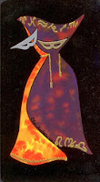
For me personally, i like my backs to be reversible if possible (since I read with reversals), for them to somehow thematically or visually 'go' with the card fronts, WITHOUT being merely a print of one of the cards (this tendency on the part of LoS particularly is rather annoying...) and just general aesthetic prettiness. I thought it'd be fun to just list some of my favorite card backs from within my tarot collection. Interestingly enough, they don't correspond all that much with which decks are my favorites overall...
Lookit, shiny!
The Fenestra tarot has what is probably my most favorite of backs...very nice, subtle color, a bit of an art-nouveau feel to it, nicely reversible, and goes perfectly with the art style of the cards themselves. As I said, not really corresponding with my deck preference generally...see, I love the minors in this deck, and it'd probably be much higher on my preferences list if it wasn't for the HUGE, UGLY, UNTRIMMABLE borders the publisher felt the need to take onto all the majors.
I traded this deck away because of that, and the universe recently saw that another copy of it came back to me, so holding onto it this time because I do like the art style and colors generally. And yes, the backs are a major plus.
Other cool backs:


I like these two a lot, the Crystal/Vetro back and the Balbi. The Crystal back doesn't really go with the art style of the deck per se, but I just really like how it looks. Reminds me of some old playing card backs I vaguely remember from when I was a kid. Nice and reversible too.
As for the Balbi, again, simple and reversible. Colors do a lot for me too - I've always liked the purple and green color combination, and the particular shades of purple and green used here really appeal. I like the vague vine type design, and the general style and bright colors perfectly encompass the nature of the deck overall and yeah, likey.
Now here are two backs that AREN'T quite reversible, but which I really like anyway. One is the Thoth back. Like the rest of that deck, it is chock full of esoteric symbolism I currently only vaguely/half-understand at best, but I can appreciate it's significance. It definitely gives you a nice feel for the rest of the deck, and visually, it just works. Plus, its not THAT badly un-reversible, so I can still read my reversals without too much distraction.
The Tarot de la Rea back, on the other hand, is very non-reversible, but given that this is one of very few decks which I DON'T read using reversals (in fact this deck likes me to use one very specific spread to read with it) that's not too much a bother. It very well represents the cool mask-filled nature of the deck as a whole and like the fronts just has a...unique, special feel to it. This deck really is one of the little treasures of my collections, and that includes the backs.


1 comments:
I'm always amazed when a great deck comes up with a What The back...
Post a Comment